Overwhelmed by Color Schemes? Learn How to Unify Your Home's Interior Design
Posted by Patricia Colomy on
For many of us homeowners, interior design is not a skill that comes naturally. Sure, we can watch all the HGTV we want and dream about executing the latest design techniques with flawless precision. But for many of us, those dreams can become nightmares.
Here you'll find some color scheme ideas for the interior of your home that'll take any remaining fear right out of your mind.
Decisions, Decisions: Color Schemes for Your Home's Interior
Many times, the hardest interior design choice to make is color. Throw in the stress of appropriately matching complementary colors, and you've got all the makings of an intimidating project that never gets started.
Deciding what color paint to use or furniture to purchase is a big investment and brings around the idea of permanence. What if we make the wrong choice and now it's rolled all over the walls? Eeek!
With companies like Behr and Benjamin Moore offering thousands of color palettes, just for paint choices... It's easy to become overwhelmed and send your redecorating projects zooming away from your home before they even start.
Luckily, basic color theory takes away a lot of the apprehension. Even if studying color theory isn't your ideal way to spend your free time, understanding how colors impact each other will give you confidence when making your interior design choices.
After you decide on a color scheme, you can order rug samples to help you test the different colors with the furniture and decor you already have at home.
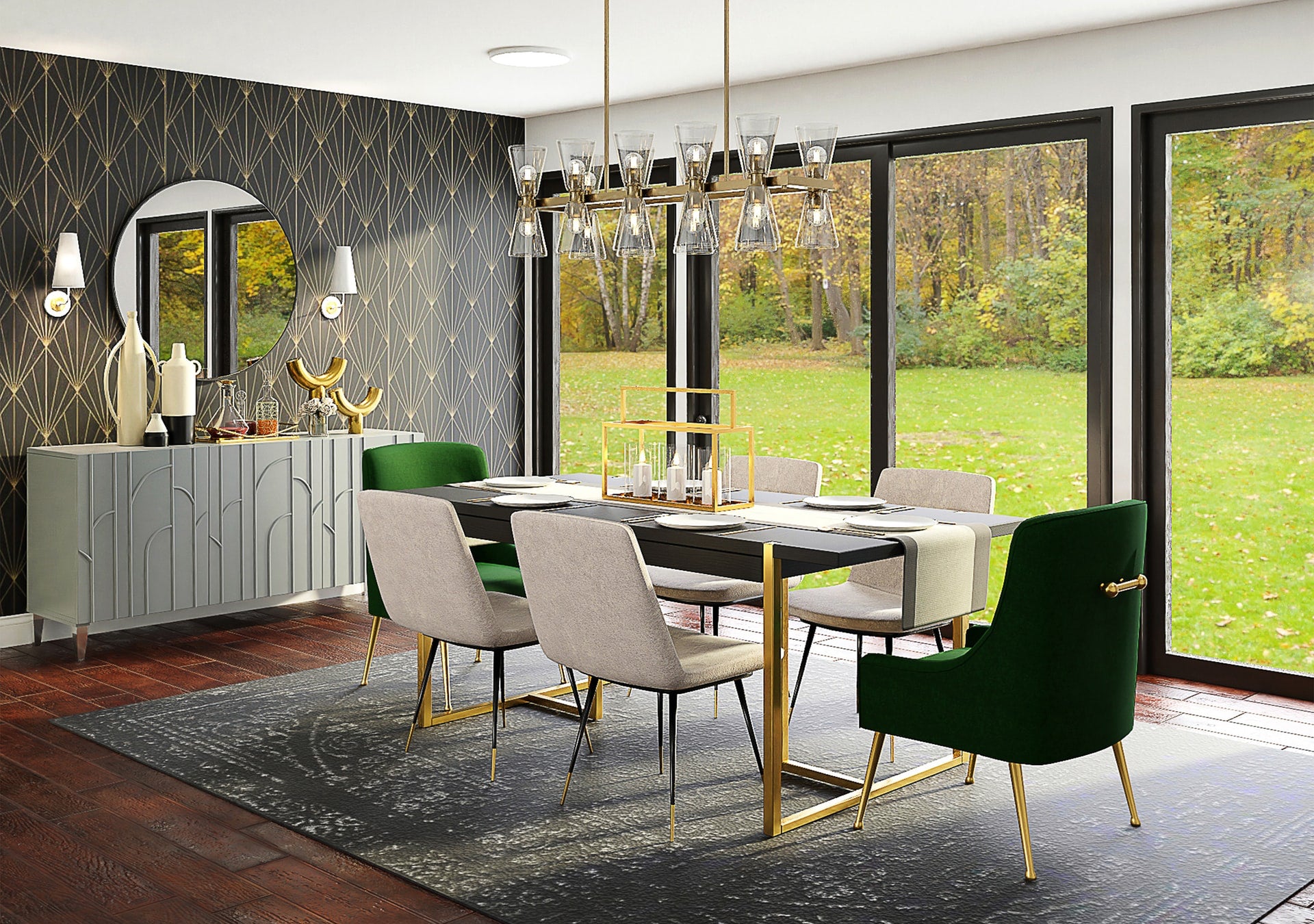
Identifying an Analogous Color Scheme
If you want to bring a sense of harmony into your home, picking a trio of colors directly next to each other will do the trick. That's the easiest way to identify analogous colors. Think of it as a monochromatic color scheme, on a small scale.
Once you've settled on your trio of colors, you'll need to decide which one to use as the base, and which two to use as accents.
Usually, you'll use the contrast between a darker shade and a lighter shade to separate your base color from your accent. If you want to bring more attention to your base color, then you could use the other two colors in this palette as accents together.

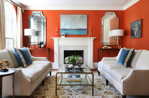
Using a Complementary Color Scheme
For a simpler color palette, focus on one color you love, and find its direct opposite on the color wheel. Those two colors are complementary to each other. And if you're wanting to use a pop of color as an accent, that complementary pairing will bring a vibrant tone into your home, while still feeling cohesive.
When it comes to developing a color scheme for your home's interior, using a complementary color pairing often turns out best when you pair your base color with your accent color in different shades.
You might be asking, how do I do that? When you have warm colors paired with cool colors, it technically makes a pair that's complementary to each other. But it usually looks like a high contrast color scheme though. Using different shades helps you lower the contrast, so the colors blend better.
Your base color might become a warm neutral, or a cool neutral like a gray area rug. And then your accent color can be more vibrant, while still feeling like you have a balanced color scheme.
How Do I Choose an Interior Color Scheme?
Still feeling iffy, huh? Maybe all the studying in the world isn't going to slay your decision-making dread.
After all, picking out a new color scheme for your home isn't as simple as picking out a new outfit – or is it? Yep, you guessed it! Your personal style for your wardrobe can be similar to your interior design style.
Using your personal fashion taste is a great place to start when considering colors for your home. In fact, professional interior designer, Kendall Wilkinson, recommends getting a clue from your closet to help determine what colors you naturally feel good in.
So take a moment and consider, what colors do you love? If you're worried about adding too many colors, but don't want your room to become drab, keep your base and secondary colors neutral and add some small, but interesting accents around your room in a tertiary color.
Throwing in some quirky toss pillows, a captivating area rug, or a radiant carpet runner can add just the right amount of pizzazz to your new space.
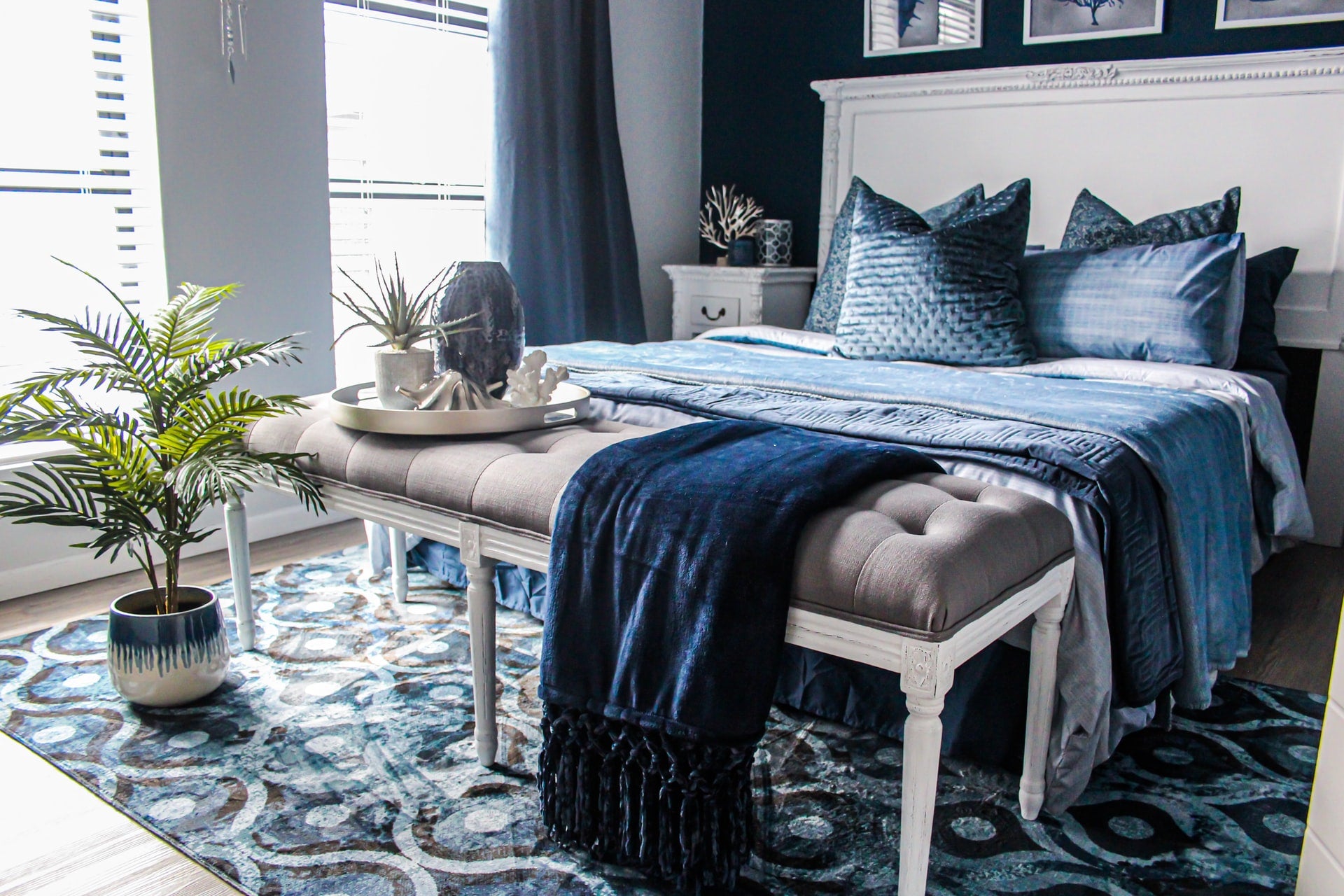
What Colors are You Already Stuck With?
You can also work your project from the other direction by taking one of your favorite pieces, like a patterned couch or area rug, and pulling your colors from there. Use the neutrals in the pattern for your base colors then add accents in your favorite color(s) from the pattern.
Designing a space in this way makes it easy to create a focal point in the room, just by using your inspiration piece.
Bold furniture can feel like a style risk since it might not be trendy after a few months, but styling it with neutral shades will help the piece stand on its own and feel more timeless. Your favorite painting can also work wonders for color inspiration.
Artwork can be very expensive and hold sentimental value, so it tends to be something you're comfortable holding on to for several years.
You might have a piece of art that set you back more than a pretty penny. Or maybe one that has been handed down for generations or was handcrafted by a talented loved one.
So why ditch it to redecorate? Don't! Instead of banishing your painting to another room, let its colors flourish at the center of your interior design! Even if the art piece contains 3-5 colors, you can focus the color palette for your room by choosing 3 colors to bring into the rest of the decor.
What Is the 60 30 10 Decorating Rule?
If structure calms your fears you can always use the 60-30-10 rule. The premise here is that 60% of the room is done in your base color, 30% is in your secondary color, and the remaining 10% is finished with a tertiary color as the accent.
Sticking to this guideline guarantees an appealing balance of your space. But for those of you who believe rules were meant to be broken, go ahead and flip this one on its back! Playing with percentages and ratios is a daring way to design a room.
Why Defining Interior Color Schemes is So Important
Okay, we've come to the scary conclusion that all of the rules, theories, and guidelines of decorating can be modified or even broken. Coordinating, clashing; it's all acceptable.
So why does it matter what combinations you put your colors in? Depending on the choices you make for your dominant shade and your accent shades, your home can feel tasteful and put together, or it can feel quirky and playful. There's a whole range of possibilities between those two scenarios, but hopefully that's enough to illustrate my point.
Our intentions matter when it comes to decorating our living spaces. We spend a lot of time there, after all! Your personal preference might be for a more relaxed and calming environment, so you'd choose colors that are different than what someone who's wanting to design a vibrant space. And vice versa.
Arming yourself with a bit of color theory will show you how to do all of it well. It might even take away those looming fears, turn your nightmares into dreams and get your confidence up so you can turn those dreams into reality.
Now it's up to you to decide what styles you want to include in your home. Go have fun with it!